


Introduction
Think about the last time you visited a website looking for something specific. Maybe you wanted to check a product, find a service, download a brochure, book an appointment, or simply get an answer to a question.
You probably expected the process to be simple.
Click. Find. Understand. Move on.
However, what happens if that straightforward path turns into a set of pointless steps?
The experience starts to feel longer than it should. You click on one section, then another, search through a page, go back, and try again. What should have taken a few moments starts demanding more attention and effort.
This is where every extra click begins to have a cost.
When a Click Starts Costing You

Clicks are a normal part of using a website. They help users explore information, make choices, move between pages, and complete tasks.
The issue arises when a click doesn’t actually assist the user.
For instance, opening three separate pages to locate information that might have been displayed on the first page just makes the process more difficult.
The goal is not to eliminate every click.
The goal is to eliminate unnecessary clicks.
The Hidden Effort Behind Every Click
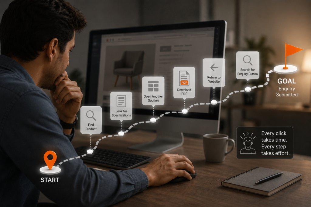
Even though a click just takes a second, it still needs focus.
Imagine someone trying to enquire about a product. They find the product page, look for specifications, open another section, download a PDF, return to the website, and then search for the enquiry button.
Eventually, the user arrives at their destination.
However, they had to put in the effort.
Instead of needing consumers to continuously figure out the interface, a well-designed experience should make that trip feel natural.
When Information Is Buried
Information that is hard to access is one of the main causes of pointless clicks.
Numerous tabs hid important specifications. Tucked in a menu are contact details. Details about prices are on a different site. forms that, in order to be submitted, users must go through multiple screens.
In theory, the data might be accessible.
However, accessibility and availability are not the same.
The experience has already caused friction if consumers have to look too far for anything crucial.
The Business Price of a Difficult Journey
When a website is hard to use, users don’t necessarily complain.
Frequently, they just walk away.
And it may directly affect the company.
A visitor may never make an inquiry if they leave a product page. A person may never become a lead if they give up midway through a form. A customer may select a different alternative if they feel that the purchasing process is unduly difficult.
An additional click might not seem like much.
However, minor areas of friction can turn into missed opportunities when they are repeated over hundreds or thousands of visitors.
Not Every Journey Needs Fewer Clicks
It is important to remember that fewer clicks don’t automatically mean better UX.
Some tasks naturally require several steps.
Buying a product, completing a detailed application, comparing multiple options, or configuring a service may require users to move through different stages.
The goal isn’t to squeeze every journey into one or two clicks.
If a click helps users make a decision, understand something, or move closer to completing their goal, it adds value.
If it exists because the information is poorly organised or the next action isn’t clear, it may need to be reconsidered.
Design the Direct Route
The best digital experiences make the path forward easy to understand.
Important information should be easy to find. Relevant calls-to-action should appear where users need them. Navigation should reflect how people actually explore the website. Forms should ask only for information that is necessary.
Most importantly, users shouldn’t have to constantly ask:
“Where do I go next?”
Good design answers that question through the interface
Conclusion
A good digital experience isn’t measured by how many features a website has or how many interactions it offers. It is measured by how easily users can accomplish what they came to do.
Some clicks are necessary. Some help users explore, understand, and make decisions. But when a click exists only because the experience isn’t clear enough, it becomes an obstacle.
That is why good UX isn’t about making everything happen in one click. It is about making sure every click has a purpose.